Skip to content
Maria Loureiro
Year
2025
Context
Academic project
Role
Wayfinding & UX Designer
Team
Three designers

GaredoOriente

A wayfinding redesign proposal for Lisbon’s Gare do Oriente: one modular visual system for signs, pictograms and a companion app concept. A proposal only — it has not been installed at the station.

Academic proposal · not implemented
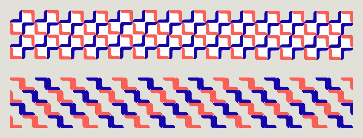
Two bands of interlocking angular pattern in deep blue and coral, built from one modular component

Challenge

Oriente is a complex, high-traffic transport hub. The proposal needed signs that tell people which level they are on and where to go next, at a glance.

Maria’s contribution

  • Modular component, logo and patterns derived from the station’s architecture
  • Directional and level signage, plus a set of identification pictograms
  • SketchUp model and Enscape renders to place the system in the station
  • Infographic and an app concept for low-impact travel

Developed by a team of three; the work shown is shared team output.

01System

One rounded corner piece does most of the work: it forms the logo, frames every sign and repeats into patterns.
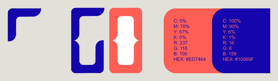

The modular corner component, the GO logo built from it, and a coral and deep blue colour palette
Component, logo and palette: coral #ED7464 and blue #10069F.
Three directional signs in coral frames: Oceanário and Parque das Nações, C. Vasco da Gama and Altice Arena, Linhas 1–2
Directional signs.

02Signage

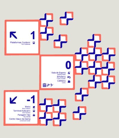
Each level sign leads with a large level number and arrow, followed by destinations and pictograms.
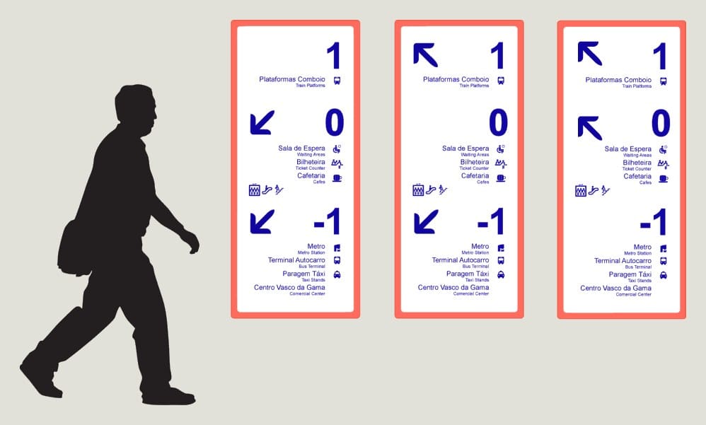
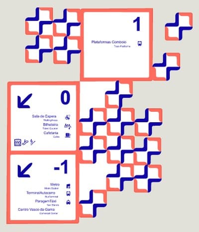
Three tall level signs showing levels 1, 0 and −1 with arrows and destinations, next to a walking figure for scale
Level signs, with a figure for scale.
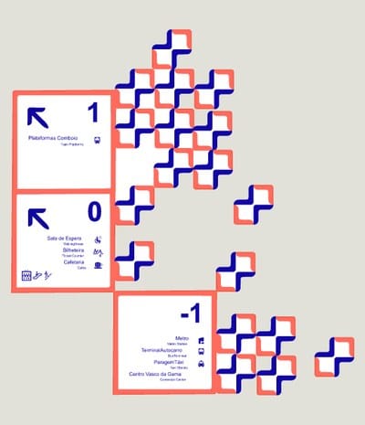
Stacked level signs 1, 0 and −1 framed by the modular pattern
Level signs stepping diagonally, with pattern pieces breaking away
Level signs set into a looser scatter of pattern pieces
Level signs paired with the pattern.
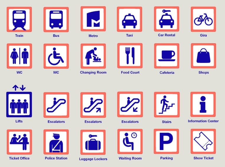
Grid of 24 identification pictograms in blue inside coral frames: train, bus, metro, taxi, WC, lifts, escalators, parking and more
Identification pictograms.

03In the station

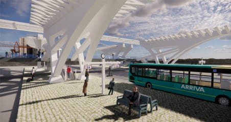
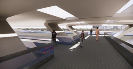
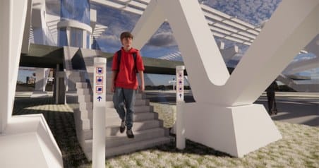
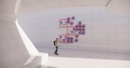
A detailed SketchUp model with Enscape renders, used to show the system in place.
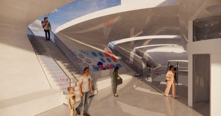
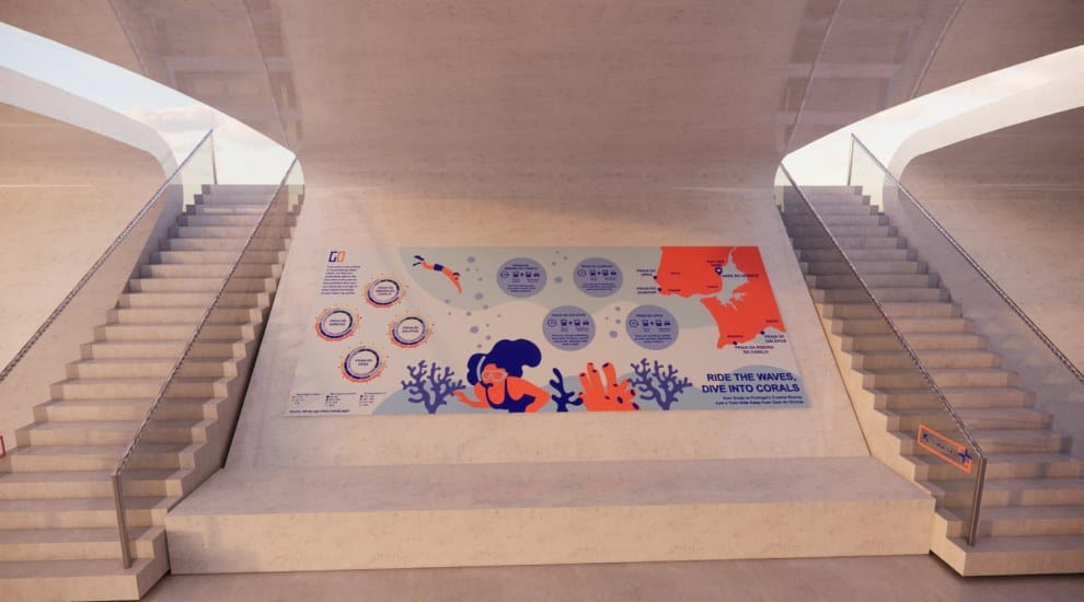
Render: stairs and walkway inside the station with the ocean infographic on the wall
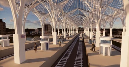
Render: the platform level under the station's white tree-like canopy
Render: the bus terminal beside the station with a green bus
Render: a covered concourse with passengers and directional signs
Render: a passenger next to a level sign at the foot of the stairs
Render: level signs and the modular pattern on a white wall
SketchUp model, Enscape renders.
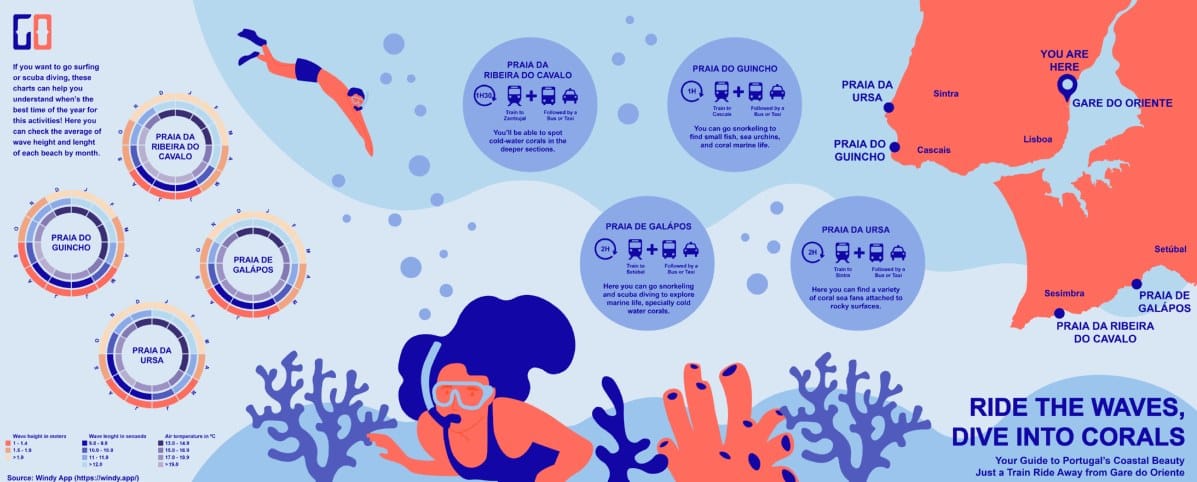
Ocean-themed infographic titled Ride the waves, dive into corals, mapping beaches reachable by public transport
Infographic.
Render of the infographic installed on the floor between two staircases
The infographic in place in the station.

04Digital touchpoint

An app concept promoting eco-friendly mobility: sustainable routes, refill stations, local initiatives and environmental updates.
App screen: Go & Flow splash screen with a beetroot mascot
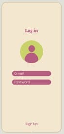
App screen: log in with email and password
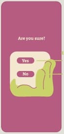
App screen: Are you sure? confirmation with Yes and No
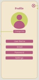
App screen: profile with photo, user name, email, password and settings
App screen: Welcome to Go & Flow, introducing the app's four features
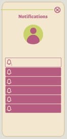
App screen: notifications list
App screen: error message, We are having a bit of a problem
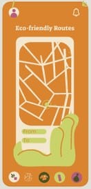
App screen: eco-friendly routes map with From and To fields
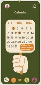
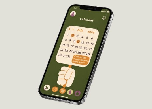
App screen: calendar for July 2024 with highlighted event days
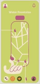
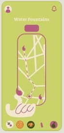
App screen: water fountains map
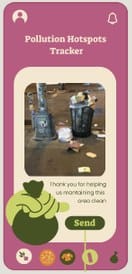
App screen: pollution hotspots tracker with a photo upload and Send button
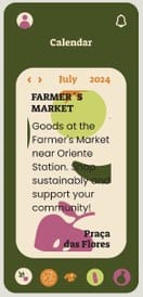
App screen: calendar event card for a farmer's market near Oriente station
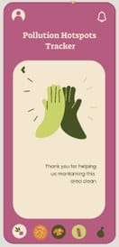
App screen: pollution hotspots tracker thank-you message
App screen: water fountains map with a walking route drawn in
Every screen of the app concept, from sign-in to routes, calendar, water fountains and the pollution tracker.
Phone mockup showing the app's calendar screen
Calendar screen on a phone.