- Year
- 2025
- Industry
- Food & beverage, hospitality
- Role
- Brand Designer
- Scope
- Identity, packaging, touchpoints
Grandma’sOven
A brand identity for a pastry and coffee shop built around warmth, familiarity and handcrafted quality, carried across packaging and physical touchpoints.
Concept identity
Challenge
Create a logo and packaging for a warm, cosy pastry and coffee shop, and turn the feeling of home baking into one identity that holds from a sticker to a shop window.
Maria’s contribution
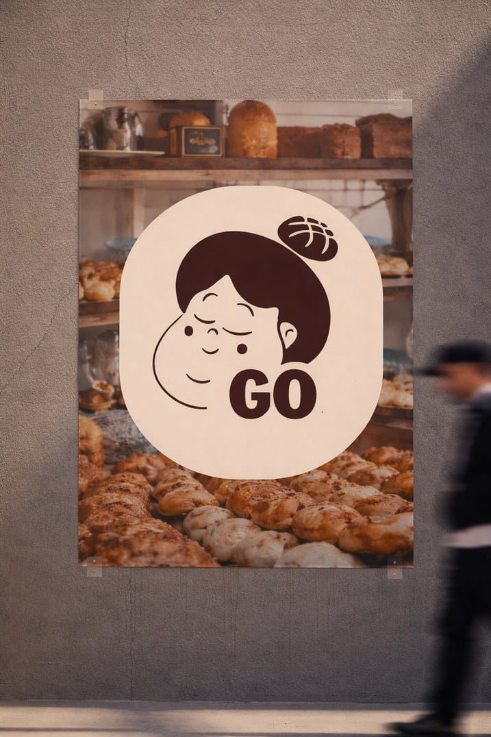
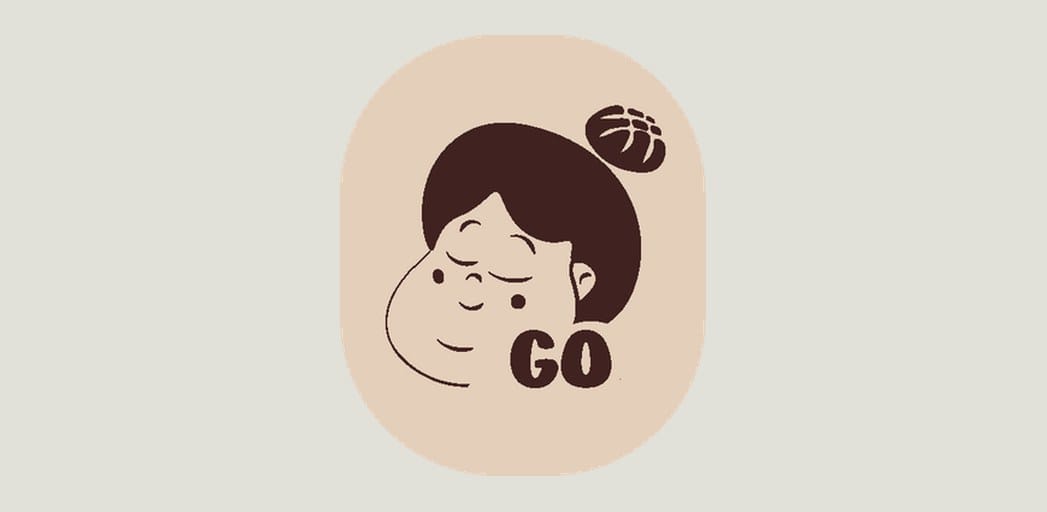
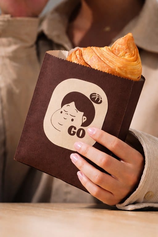
- Illustrated logo and a compact GO mark
- Two-colour palette of cream and dark brown
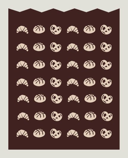
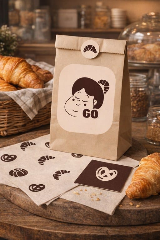
- Stickers and a repeat pattern of baked goods
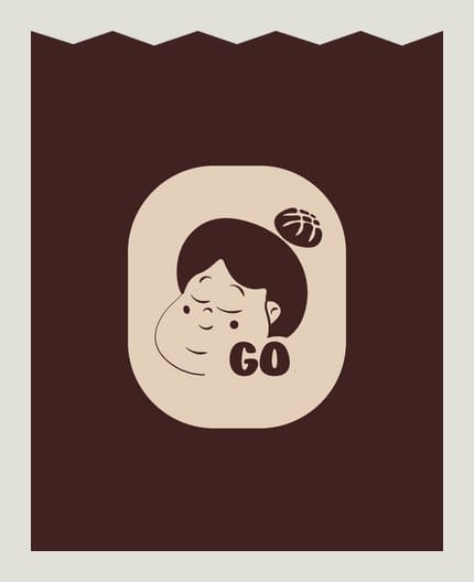
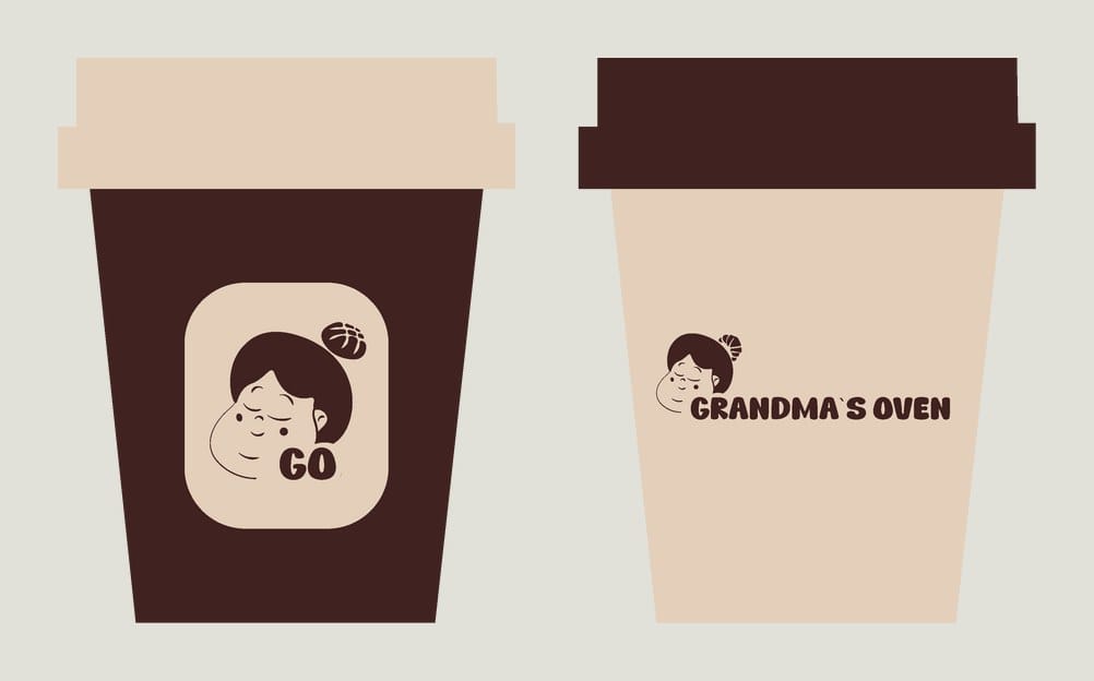
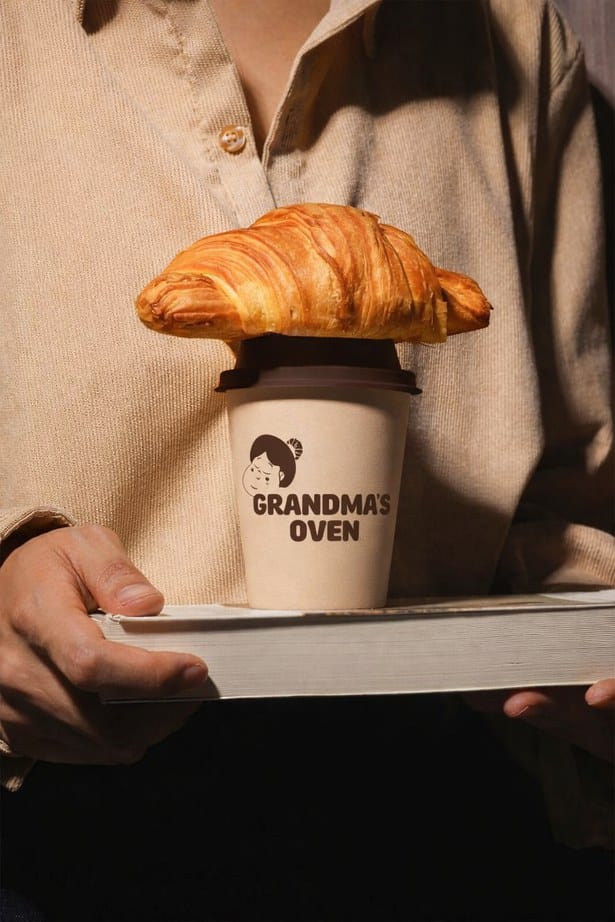
- Packaging: paper bags and coffee cups
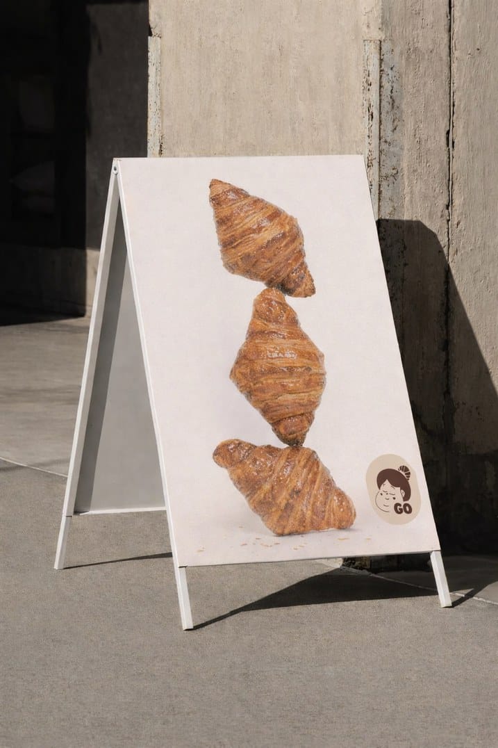
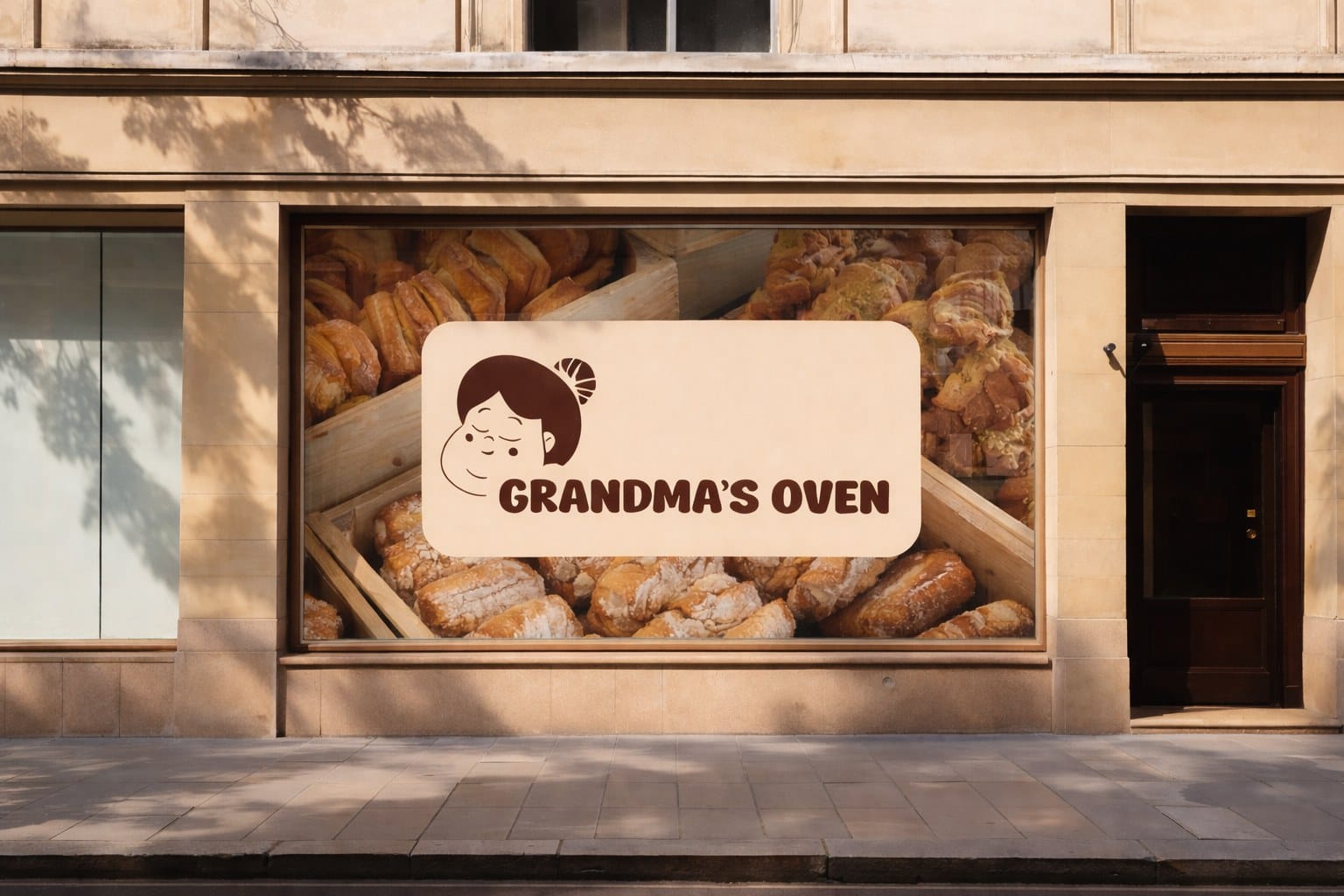
- Touchpoints: shop window, signage and posters
01Identity
Soft earthy tones, tactile references and friendly typography. A compact GO mark carries the illustration on small surfaces.

02Packaging
Every surface uses the same two colours, so a bag or a cup reads as Grandma’s Oven on its own.
03Touchpoints
The system was designed to scale across physical and digital touchpoints while keeping its warmth.